Overview
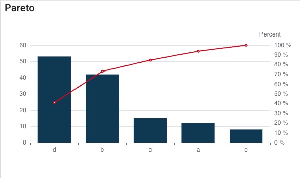
The Pareto chart (or Pareto diagram) is a fundamental analytical tool, often used for prioritization in contexts such as continuous improvement or quality control.
What is it?
It is a bar chart in which problems, defects, or causes are ranked from largest to smallest.
Main Objective:
The primary objective of the Pareto chart is to identify the “vital few” causes as opposed to the “trivial many” that are responsible for the majority of problems. This principle is commonly known as the 80/20 rule.
Structure:
- Problems or causes are displayed as bars, sorted in descending order of importance (frequency or cost).
- A cumulative line is also plotted, showing the cumulative number of defects as you move from the most significant defect to the least significant one.
Use:
It is a basic tool used to convert raw data into actionable information. Its main purpose is to identify the “critical few” causes that generate most of the problems.
msg.payload = {
"data": [
{ x: "a" , y: "a-value" },
{ x: "b" , y: 42 },
{ x: "c" , y: 15 },
{ x: "d" , y: 53 },
{ x: "e" , y: 8 },
],
}
return msg;